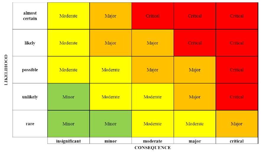
Of all the chart types used for data analysis, heatmaps don't get as much attention as charts like bar graphs or scatter plots. But heatmaps are a highly effective way to visualize certain kinds of data. Used correctly, they can quickly reveal insights that may be difficult to see with other techniques.

What is a Heatmap?
A heatmap represents data through variations in color. Typically, it uses a spectrum from light to dark to show magnitude or frequency. For example, blue shades could indicate low values while red shades indicate high values. The color cells are then arranged in a grid, allowing you to see patterns across categories.
Key Benefits of Heatmaps
- Spot trends and outliers - Heatmaps make it easy to identify clusters, gaps, and anomalies in your data. You can quickly pick up on trends and relationships.
- Identify correlations - The color shading helps you identify correlation strength between data variables. You can see which factors tend to move together.
- Understand scale - With a colorbar key, heatmaps allow readers to interpret gradients and intensities. You gain perspective on the scope of values.
- Compact format - Heatmaps condense multidimensional data into a small visual footprint. You can see a lot of data compactly in one chart.
- Aesthetically pleasing - The color shading creates an aesthetically pleasing chart. Patterns seem to jump off the page.
Ideal Data Types for Heatmaps
While heatmaps can work for many data types, they are especially effective for:
- Time series data
- Spatial data
- Correlation matrices
- Large sample sizes
By leveraging heatmaps more often, analysts can bring patterns and insights to the surface faster. Their ability to showcase variation makes heatmaps a hugely valuable addition to any data visualization toolkit.